
Our services ranges from SEO to PPC taking your brand to new heights by generating traffic and leads. Our expertise are Web Designing, Web Development, SEO, SMM, PPC, E-Mail Marketing and other top digital services.

We will help you to turn your company's logo into a unique brand.

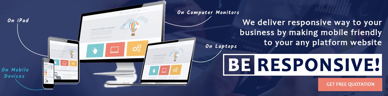
Give your website the perfect mobile responsive experience by making Responsive Website.

Drive more leads and traffice to the site by redesigning your website.
Grab your customer attention by providing them a rich user experience.

Provide your page's content a responsive design through HTML page designing.

Stunning and effective home page design layout attracting user's attention.
A usual website gets easily set up on every desktop and provides the ideal view to the user. But with the advancement in technology and digitization, people look for more advanced options. Days are gone when only desktops were used to access the internet. Nowadays people have access to every work, service, information etc directly on their smartphones. They prefer surfing the internet on phones rather than on the desktop and get access to all those stuff which can be done through the desktop screen. So, there is a specific need to get the website an optimal screen resolution which is fit for every gadget.
The user-friendly design of the website gives an attractive and perfect user experience to the audience. No company will ever desire to get their audience face issues while surfing the website. The website of the company must be optimal and easy to use so that the user gets a better experience. The user-friendly nature of the website becomes even more important when the audience prefers to get access to the website over their smartphone gadgets. Just as the website gives a user-friendly experience to its user on the desktop, the same experience has to be delivered to the mobile website user as well.
A well-optimized mobile responsive site provides world-class user experience to the audience. A mobile responsive site loaded with super responsive website features such as optimal screen resolution, user-friendly website, fast loading speed, low bouncing rate, and other features builds an everlasting impression on its visitors. This, in turn, makes the visitors stay and spend some more time exploring the website. And thus the mobile-friendly, user-friendly and best user experience nature of the website drives more traffic to the website. Driving more traffic to the website is the most needed activity for the website's growth and survival in this competitive industry.
The bounce rate of the website depends on various factors. The user to the website, the web design, loading speed of the website and so on. The user has the main importance in the bounce rate calculation. When users find the website easy to use and explore, it naturally decreases the bounce rate of the website. Whereas if the user to the website founds a problem while surfing the website such as the slow loading speed of the website, the boring website design, no relevant content, it automatically increases the bounce rate of the website. A good website always gives importance to such factors and makes sure that the website has as low as possible bounce rate.
A responsive website adds a lot of benefits to the website. It gives the website high speed, best user experience, optimal screen resolution, low bounce rate and much more. A website with such pearl benefits attracts more users to the website. The user explores the website enjoying the best user-friendly experience. Such benefits let the user to freely explore the product and service they desire. And thus, there are several conversions probabilities to the website as well. Thus a mobile-friendly responsive website yields growth to the website by yielding high conversion rates.


